
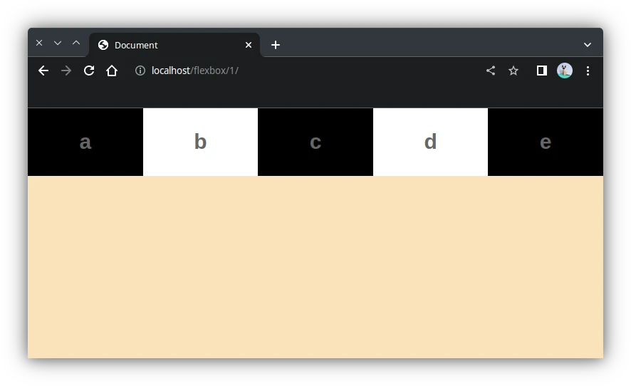
1. Contenedor básico de tipo flex con 5 elementos
<div class="contenedor">
    <div class="elemento">a</div>
    <div class="elemento">b</div>
    <div class="elemento">c</div>
    <div class="elemento">d</div>
    <div class="elemento">e</div>
</div>
.contenedor{
display: flex;
}
.elemento{
width: 300px;
padding: 30px;
font-size: 30px;
font-weight: bold;
text-align: center;
color: #666;
}
/*para elementos impares*/
.elemento:nth-child(odd){
background-color: #000;
}
/*para elementos ppares*/
.elemento:nth-child(even){
background-color: #fff;
}
2. Dirección Flex (row, column)
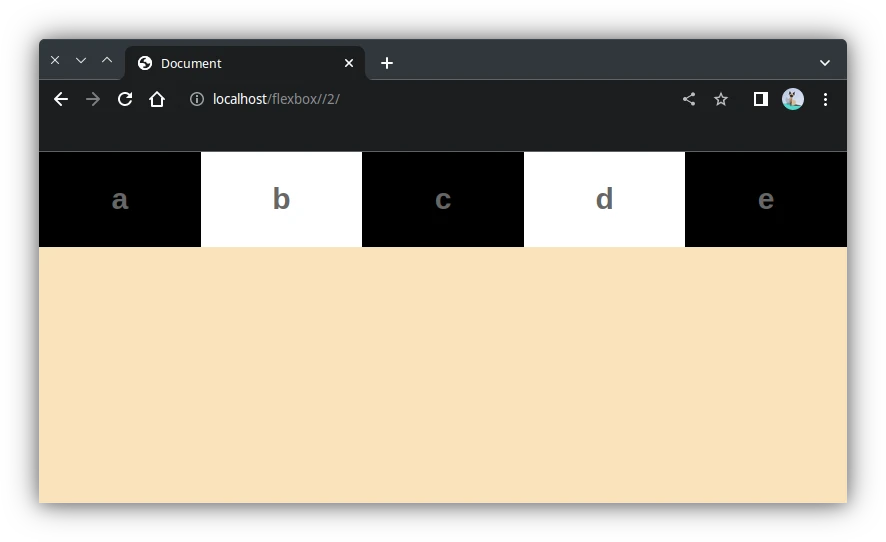
2.1 row (por defecto)
.contenedor{
    display: flex;
    flex-direction: row;
}
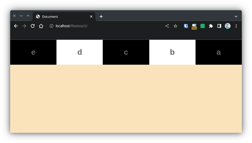
2.2 row-reverse
.contenedor{
    display: flex;
    flex-direction: row-reverse;
}
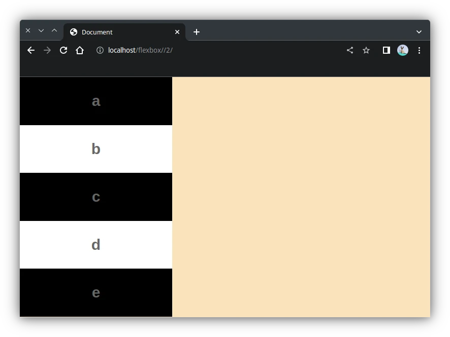
2.3 column
.contenedor{
    display: flex;
    flex-direction: column;
}
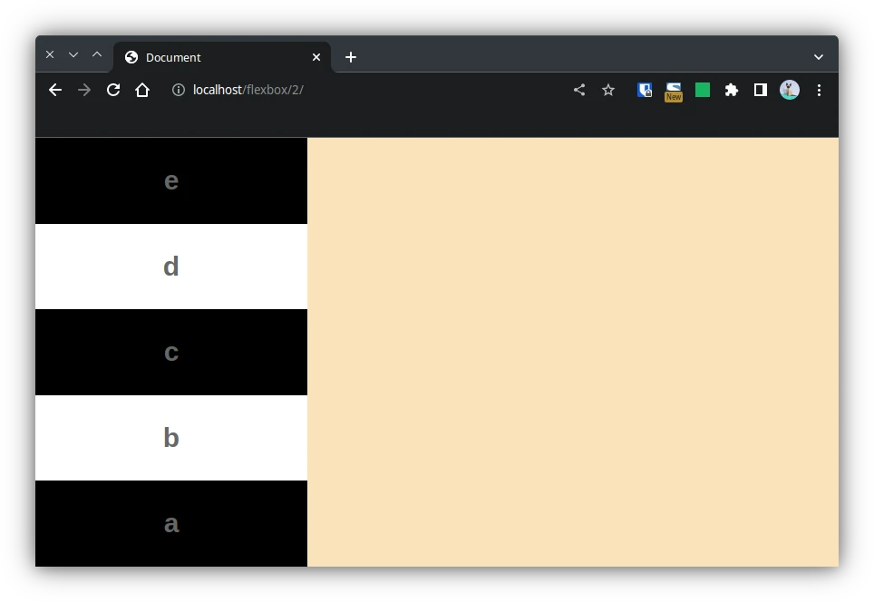
2.4 column-reverse
.contenedor{
    display: flex;
    flex-direction: column-reverse;
}
3. Filas (flex-wrap)
<div class="contenedor">
    <div class="elemento">a</div>
    <div class="elemento">b</div>
    <div class="elemento">c</div>
    <div class="elemento">d</div>
    <div class="elemento">e</div>
    <div class="elemento">f</div>
    <div class="elemento">g</div>
    <div class="elemento">h</div>
    <div class="elemento">i</div>
    <div class="elemento">j</div>
</div>
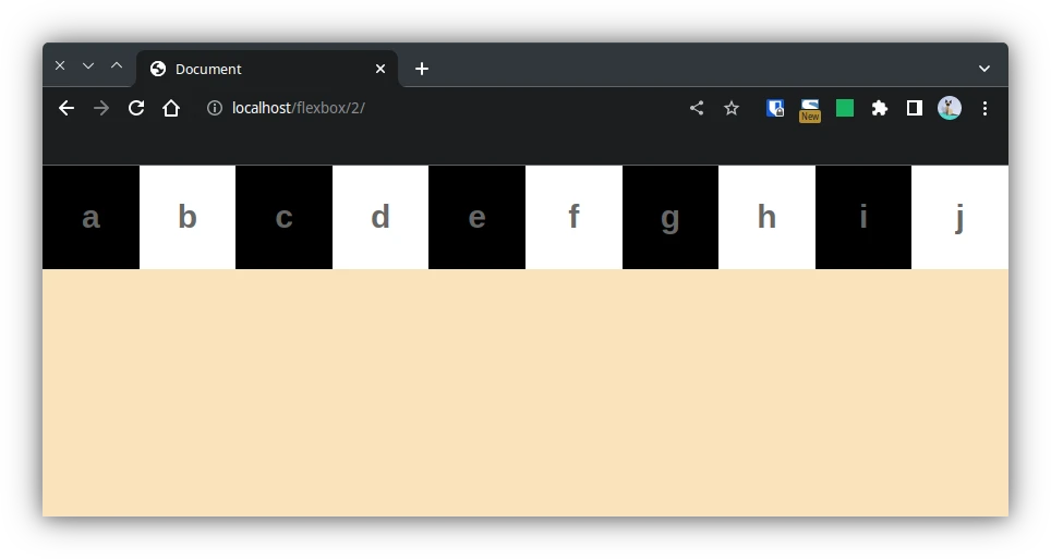
3.1 frex-wrap: nowrap (por defecto)
Los elemenos adaptan su tamaño para caber en la fila.
.contenedor{
    display: flex;
    flex-direction: row;
    flex-wrap: nowrap;
}
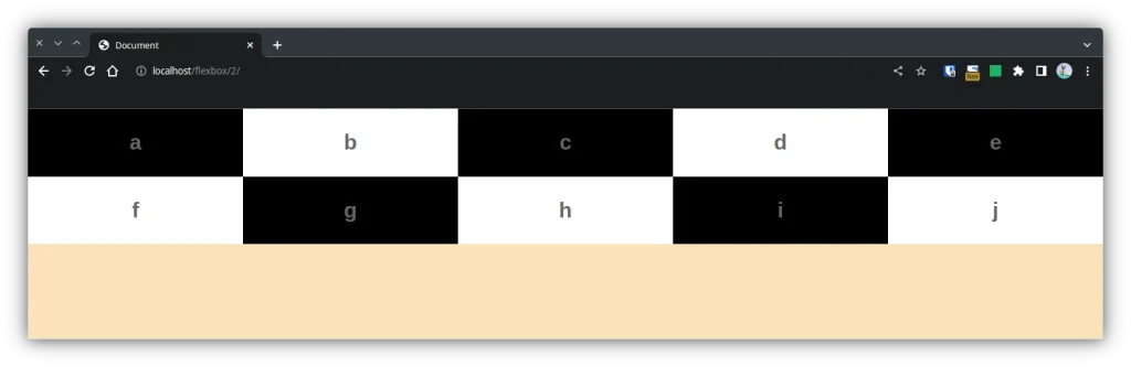
3.2 flex-wrap: wrap
Los elementos respetan su ancho (300px) y ocupan otra fila cuando no caben.
.contenedor{
    display: flex;
    flex-direction: row;
    flex-wrap: wrap;
}
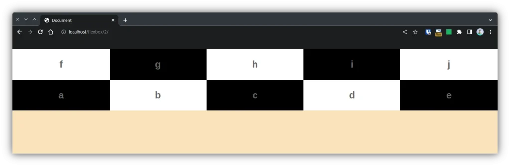
3.3 flex-wrap: wrap-reverse
.contenedor{
    display: flex;
    flex-direction: row;
    flex-wrap: wrap-reverse;
}
3.4 flex-flow
Agrupa flex-direction y flex-flow en una única propiedad.
.contenedor{
    display: flex;
    flex-flow: row wrap;
}
.contenedor{
display: flex;
flex-flow: row wrap-reverse;
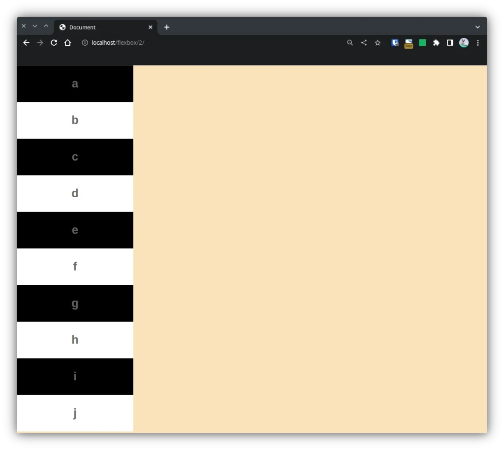
}.contenedor{
display: flex;
flex-flow: column wrap;
}
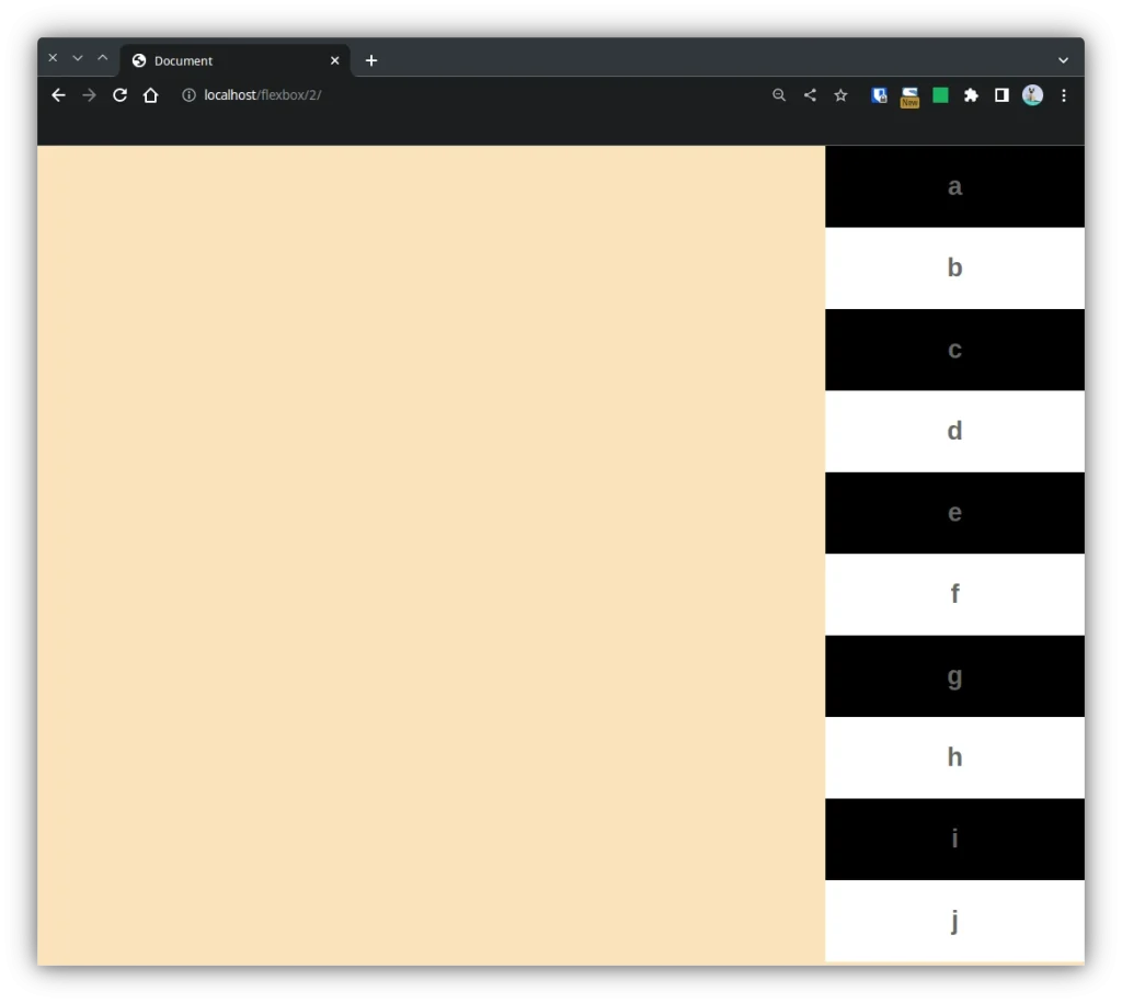
.contenedor{
    display: flex;
    flex-flow: column wrap-reverse;
}
4. Alineación
4.1 justify-content
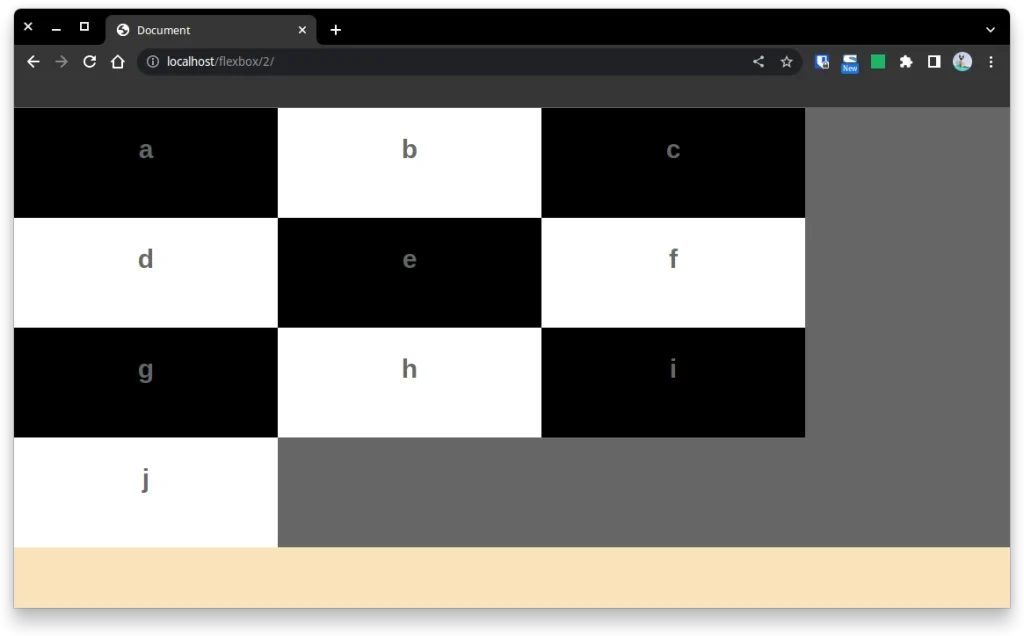
4.1.1 justify-content: start
.contenedor{
    display: flex;
    flex-flow: row wrap;
    background-color:#666666;
    height: 500px;
    justify-content: start;
}
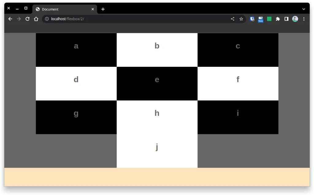
4.1.2 justify-content: center
.contenedor{
    display: flex;
    flex-flow: row wrap;
    background-color:#666666;
    height: 500px;
    justify-content: center;
}
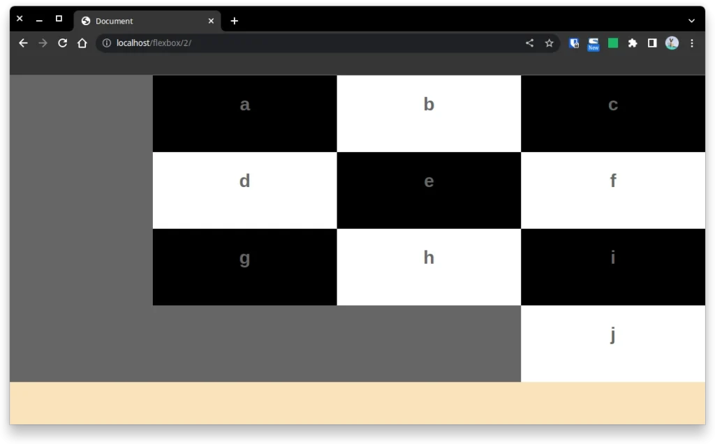
4.1.3 justify-content: end
.contenedor{
    display: flex;
    flex-flow: row wrap;
    background-color:#666666;
    height: 500px;
    justify-content: end;
}
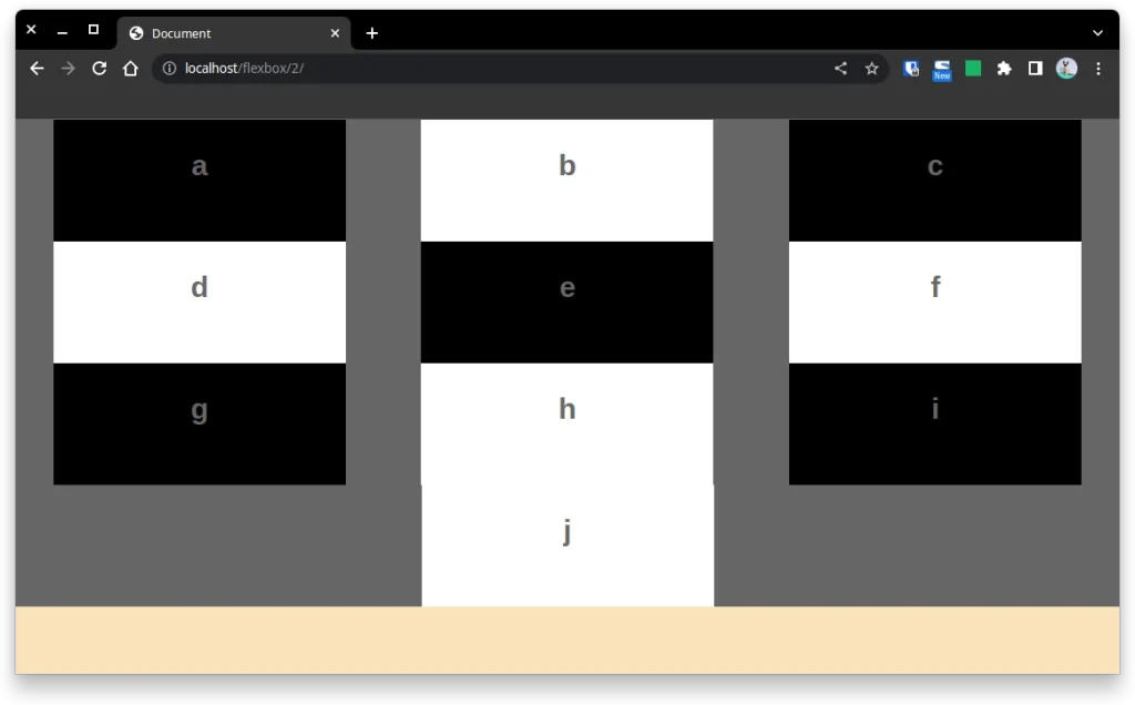
4.1.4 justify-content: space-around
.contenedor{
    display: flex;
    flex-flow: row wrap;
    background-color:#666666;
    height: 500px;
    justify-content: space-around;
}
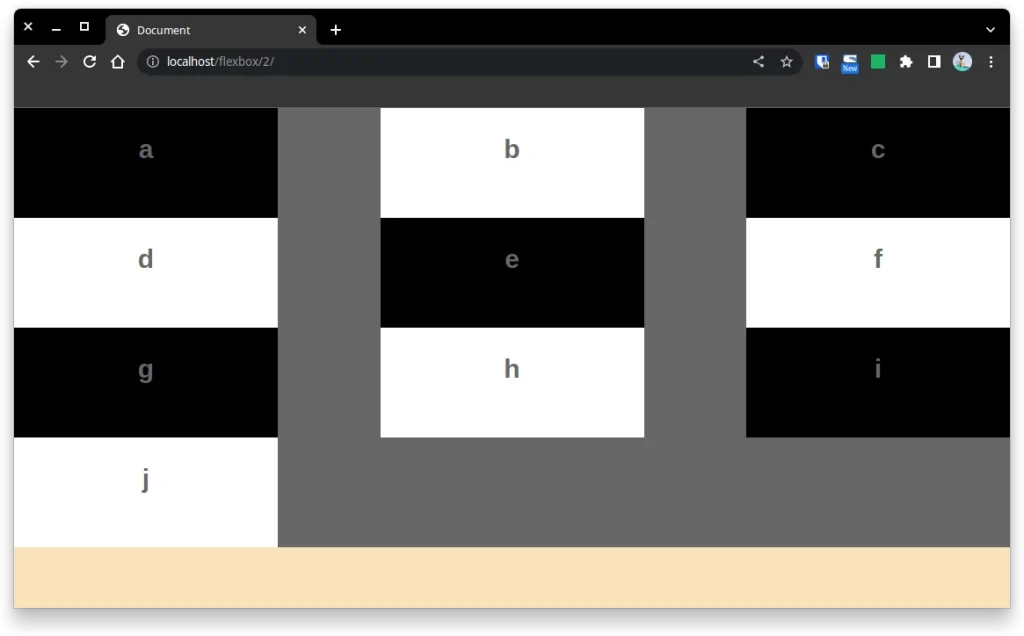
4.1.5 justify-content: space-between
.contenedor{
    display: flex;
    flex-flow: row wrap;
    background-color:#666666;
    height: 500px;
    justify-content: space-between;
}
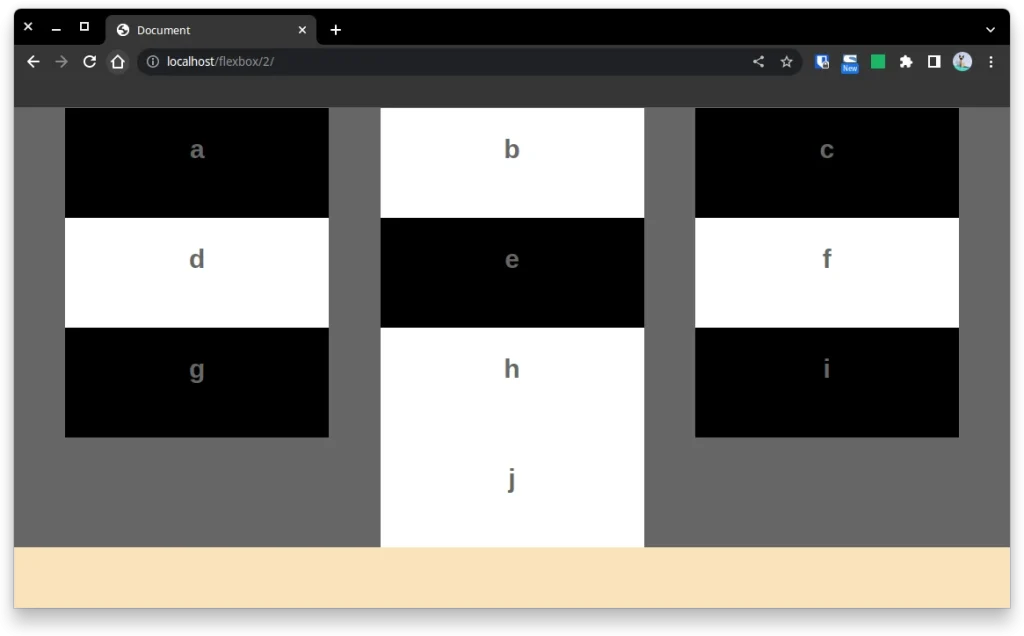
4.1.6 justify-content: space-evenly
.contenedor{
    display: flex;
    flex-flow: row wrap;
    background-color:#666666;
    height: 500px;
    justify-content: space-evenly;
}
Continuará…